
Heya, wltr3565 here. As you can see, Hell Blasters took the 8-bit look. Making the game simply with pixel arts and low resolution is one thing, but while at it, why not keep it as faithful as how the technology was at the time as humanely possible? This devlog will explain the decisions made for Hell Blasters’ visuals.
No, it doesn’t go as far as sprite flickering.
Color Decision
The target platform to emulate the visual design from, the 8-bit NES / FC, has limited color palette available, around 54 colors only or so. This is the first step and consequently, any and every design will have their colors follow the chosen 54 colors (not counting black), regardless of the smoothness of the produced artwork inside or outside the game.

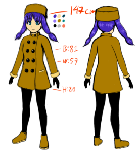
This extends to the human characters! Winter and Summer, for example, their colors follow the limited 54 colors. No room for subtle colors, bold ones only!
Pixels and (lack of) Effects
The 8-bit consoles didn’t have the capability of rotation and scaling too, something we take for granted today. Hell Blasters is committed to not use any modern graphical tricks (except for the wallpapers. That’s outside the main game). No rotation or scaling that will mess up the sprites, no transparency. If you see some level of transparency, actually it’s an old trick: The “transparent” image is flickered for each 2 frames, creating the illusion of transparency. Which is rad in action.
Giving dedication to this style is indeed limiting, but one of the benefits is it’s easy to animate things, including for cutscenes! Feels like making an anime show!

That’s all for now. Stay tuned on next Wednesday for the next devlog!
More info: